Shopping cart abandonment is an occurrence that plagues many retailers and webshops all over the world on a daily basis. By definition, shopping cart abandonment is when a potential customer starts the checkout process for an order online but drops off before completing the purchase. You will probably all agree with me when I say that the thought of the customer getting all the way to the shopping cart only to leave empty-handed is a very troublesome one, which is why it’s important to take action and stop it. While there are many customer experience (CX) solutions that can help avoid this problem, such as user feedback, ad retargeting and email recovery campaigns, there is another area that deserves some attention as well: user experience (UX).
This article will outline 5 key UX strategies that can be applied to reduce shopping cart abandonment! But first things first. Let’s start with the root causes. In other words, why are your visitors abandoning their carts in the first place?

The main causes of shopping cart abandonment
According to Shopify, these are the main reasons for abandonment that you’ll want to avoid:
- Being forced to create an account
- Struggling with complicated checkout processes
- Unexpected delivery costs: this adds up to nearly 44% of shoppers who abandon their cart!
- Concerns over security
For additional reasons, check out this infographic. Now that the root causes have been clarified, here are 5 UX strategies you can use to reduce shopping cart abandonment.

Free White Paper: Increasing Online Sales with Customer Feedback
Looking for new ways to boost online conversions and increase sales on your websites and apps?
1. Make sure all pages are optimised for both mobile and website
For most online retailers and webshops, mobile shoppers represent a somewhat frustrating customer segment and with the rise of mobile shopping, a lot of these businesses are left scratching their heads. Where should they start? How can they improve the user experience so that visitors are more likely to complete a purchase on a mobile device?

If we look at the basics, there are a lot of generic factors the business must consider including design, speed & responsiveness and content that must be implemented seamlessly. However, if the goal is to reduce (mobile) shopping cart abandonment, it’s important to identify the reasons why your customers are leaving the shopping cart too early. Some of the top reasons include a distracting design, forms that are much too long, and a lack of A/B testing beforehand.

A distracting design is the most common reason for abandonment. Once your visitor has successfully placed their item in the shopping cart, the last thing you want to do is make it hard for them to continue with their purchase. For example, try removing your standard navigation or footer elements on checkout pages. Therefore, here the best strategy to keep the page as simple as possible.
Another reason for abandonment is having too long of a form on the checkout page. Touch keyboards are not always the easiest in terms of navigating throughout the page and when you put the burden of filling in a long form on your visitor, they’re likely to get frustrated and leave.
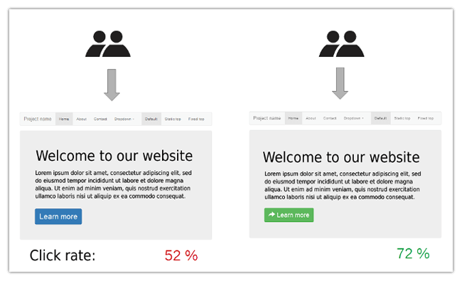
Lastly, we all know that A/B testing is important, especially for maximising conversion rates so it is critical that you conduct A/B testing on both your website AND your mobile app.

2. Don’t make registration mandatory for checkout
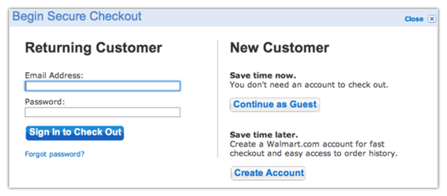
This is something we can probably all relate to. After spending nearly twenty minutes of your time picking out Christmas presents for all of your family members, you’re finally ready to checkout. When you go back to your shopping cart and click ‘Checkout’ however, you’re surprised to find that you must first make an account (perhaps with a webshop you will never use again). While it’s great that you offer this option to your shoppers, it is also seen as a point of friction for them. Maybe they’re wondering how long it will take or if it’s really worth their while to fill in such a long form if they don’t plan on coming back any time soon. Either way, it increases their chances of leaving mid-purchase.

A lot of businesses now offer Guest Checkouts. This is a much more user-friendly approach which has proven great for conversions!
3. Clearly indicate the stage of process
A progress indicator is especially important for visitors on-the-go who are looking to checkout quickly. A feature like this often makes the process less overwhelming as it can both identify how far long the customer is in the process as well as how much further they still need to go. A lot of businesses split the process up into steps such as Billing/Shipping, Shipping Method, and Payment/Order Summary to give the visitor a good overview of the process.

4. Show the amount due early on and clarify that the payment is secure
In terms of payment issues, there are two easy solutions that businesses should use to ensure their customers successfully checkout.
The first is not surprising the customer with additional costs once they’ve clicked through to the final payment page. For example, a lot of times businesses will add additional (unexpected) delivery costs at the very end of the funnel. This is somewhat of a tricky case because it’s hard to show delivery costs upfront without knowing the location beforehand. Some options businesses may want to consider so as not to annoy their customers include offering free shipping, showing an estimate beforehand, or even offering a delivery calculator.

The second is ensuring that your customers feel secure using your website. This is especially crucial when customers are filling in details such as private credit card information. A great way to gain their trust and therefore, reduce shopping cart abandonment is by simply adding security verification icons to your site, e.g. VeriSign logos.

5. Make sure your customer can easily ‘change’ or ‘save’ their shopping cart
We recommend offering two additional features to your shopping cart: the ability to change it and the ability to save it.
The first (the ability to change your cart) is perhaps obvious. But on top of offering this feature, it’s also important to accommodate these customers in a very simple and intuitive way. For example, by placing an easy-to-use ‘Edit cart’ button on the shopping cart page.

Additionally, a saving feature can be really helpful. Nearly 84% of online shoppers are comparison shoppers, meaning they are likely to jump from website to website looking for similar products at a better price or offering better terms before purchasing. A lot of times they’ll even look for days before finally coming to a decision. However, should you provide your visitors the ability to save their shopping carts, the chances they’ll complete their purchase when they come back are much higher. Doing this also lets your business keep track of particular items they’re interested in for future purchases.
No more drop offs!
For a lot of online retailers and webshops, shopping cart abandonment still remains a significant challenge. We hope that these strategies will help you reduce your shopping cart abandonment as well as build customer loyalty.
Keep in mind, however, that UX is only one area improvement. Customer Experience should also be a focal point in reducing shopping cart abandonment. Read more here about how you can use customer feedback to keep shopping cart abandonment rates low.
Ready to see Mopinion in action?
Want to learn more about Mopinion’s all-in-1 user feedback platform? Don’t be shy and take our software for a spin! Do you prefer it a bit more personal? Just book a demo. One of our feedback pro’s will guide you through the software and answer any questions you may have.


