

Again it’s time for another Mopinion product update! And we’re keeping those updates coming! This month we’ve got a lot of new features and updates for you including some much anticipated chart improvements, such as adding multiple data sources to one chart and much more.
Psssst…Mopinion’s Classic user interface is being phased out!
Are you ready to sweeten up your user experience? If you signed up this year you’re already using our new and easy Mopinion Raspberry interface. But if you signed up prior to December 2020, you might know our ‘Classic’ interface.
It is time for an easier and more seamless way of collecting feedback. Just a few more weeks left until we make the transition to our fresh, new interface Mopinion Raspberry and phase out of the former ‘Classic’ environment. This will happen on the 30th of June. Be sure to switch over today if you haven’t done so already and discover everything this next generation user interface has to offer!
Learn more here
Now let’s take a look at what’s new this month…
Overview of the latest Mopinion updates:
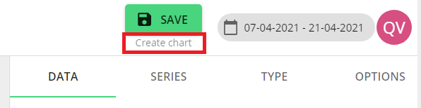
- Analyse and compare multiple data sources in one, single chart
- Various chart improvements
- Email alerts for multiple users
- Social login for Enterprise users visible by default
- Cached redirects after login
Ready to learn more about these updates in more detail? Keep reading…
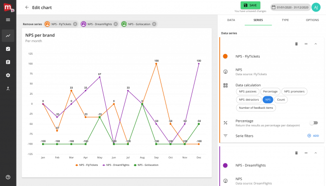
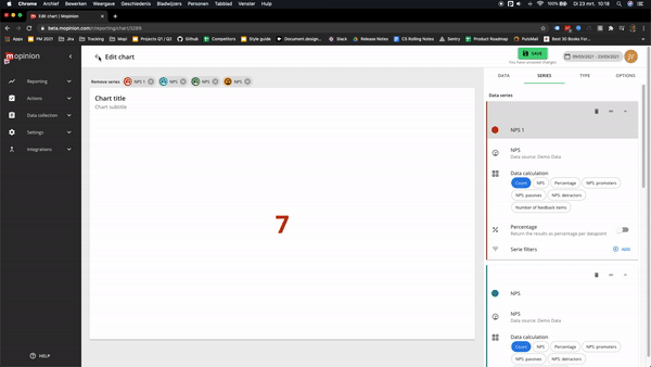
1. Analyse and compare multiple data sources in just one, single chart!
When you’re working with complex feedback data across multiple channels, brands, domains or funnels, eventually you’re going to want to compare metrics across these channels. Previously it was only possible to analyse the data from a single data source inside a chart. This made it more complex to analyse and compare data from multiple data sources. You’d have to either use one generic form across all channels, create a custom dataset manually or use different charts.
We listened to your feedback on this issue and we developed the possibility to analyse and compare data from multiple data sources in one chart. This new and unique feature will allow you to compare your customer satisfaction score across different channels, your NPS across multiple brands, your goal completion rate across different funnels or compare any other metrics inside your feedback.
Note: you can expect an in-depth ‘Behind the Feedback’ article on this very soon!
2. Various chart improvements
To build off of this first feature, Mopinion has also released various other improvements to the chart builder, including a handful of useful, new updates and user experience improvements:
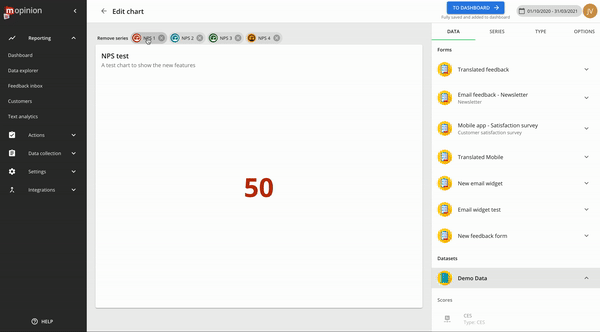
+ Our solution now does all the thinking for you by letting you see which data series can be used in your charts (from different data sources or one feedback form). This will help prevent the occurence of ‘broken charts’. So for example, say you’re analysing the content score of one of your emails, the chart builder will automatically highlight other relevant scores you can compare this score with, like the content scores of your other emails.
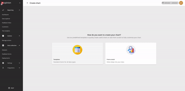
+ We’ve also improved the chart creation from a template flow. It is now both faster and easier to create a chart. Instead of having to select a data field from which you want to create a chart, you can now just select the data source and we’ll show you the most relevant options right away.
If you’d like more control, you can still filter on a specific data field inside your form to view possible charts for that data field. The example below illustrates how easy it is to create a chart from a template.
+ You can also manually adjust the min and max of the Y axis scale, instead of just fixed options. This way you can set the scale to your needs; an option which can come in handy when the default setting is not showing the proper scale (a scale up to 100, when you’re using data points between 1-5 for example). You can find this option by going to Sidebar => Options => Scale.
+ If you click on one of the data points you’re using in your chart, you will directly scroll to that data point in the sidebar.
+ While adjusting a chart, there is a button with a helper in the top right corner that shows the status of your chart. It also gives you the option to add the chart directly to your dashboard.
+ If you want to go ‘back’ from the chart builder, you will now get a pop up if you have ‘unsaved changes’. This will save you from losing any settings you’ve created within the chart. Better safe than sorry, right?
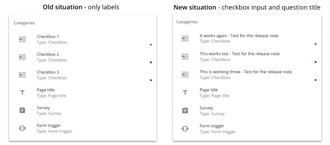
+ Improved titles for check boxes, likerts, and matrixes. Before: you’d only see the labels of the checkbox entry. Now: you’ll see the actual question added as well.
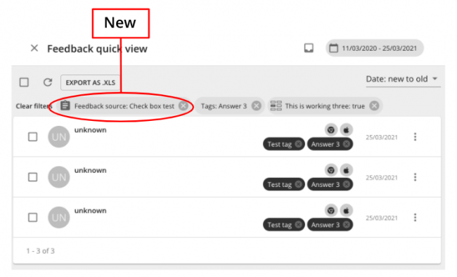
+ When you now click on the feedback quick view for your x-axis tag, it not only filters on that tag, but also on the form you’re using. This way you’ll only see relevant items in the quick view.
3. Introducing email alerts for multiple users
Sharing is caring in the feedback industry, especially if you want to make real change on your digital channels! Previously, when setting up an email alert in Mopinion Raspberry, you could only add one recipient to the alert. This meant that you had to create individual alerts for each member of your team which if you work in a larger team, could’ve been quite the time consuming process.
However now it’s possible to add multiple users to an alert, enabling you to share insights in on sweep and therefore, take action on your feedback more effectively!
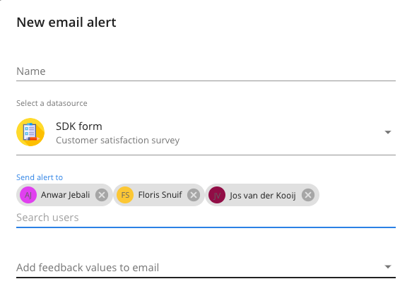
Bonus: this new feature also works for your existing alerts. All you need to do is go back and add the recipients.
4. Social login for Enterprise users now visible by default
And lastly, the social login for enterprise users is now shown as a default…
By setting up the social login feature for your user account in your account settings (Enterprise only), you can log in to Mopinion with your Google credentials. This feature was already available upon request by Enterprise users, but can now be activated by all Enterprise accounts within the product.
Want access to this feature?
You can start using this feature (and many more) with our Enterprise Package. Gain access to Unlimited Dashboards, Unlimited Domains and SDKs, Dedicated Domain & Storage, Bespoke Training Services and Regular Team Consultations. Interested? Don't hesitate and get in contact with our team.
5. Cached redirects after login
Previously when you would receive a link to a specific feedback item in Mopinion – whether that was from a colleague, in an email (email alerts or forwards) or from a webhook- you would be prompted to login first (when your session has expired) in order to view the item. However, after logging in, you were redirected to the homepage rather than the item you wanted to view. Thanks to the feedback of our users, we’ve since improved this process by making it possible for you to – after logging in – land directly on the page you initially wanted to visit (i.e. the detail page of a feedback item).
Suggestions or questions about the new updates?
Do you have ideas or suggestions on how we can improve our software to meet your needs? We are always open to new ideas! Leave some feedback, we love to hear what you think – but that shouldn’t come as a surprise!
Ready to see Mopinion in action?
Want to learn more about Mopinion’s all-in-1 user feedback platform? Don’t be shy and take our software for a spin! Do you prefer it a bit more personal? Just book a demo. One of our feedback pro’s will guide you through the software and answer any questions you may have.


