In the beginning of 2020 Mopinion Raspberry, the new user interface, goes live. In this five-part series, we will ‘unmask’ various new components of the software one by one, components that are guaranteed to give you a smooth and lucid user experience. Unmasking Mopinion Raspberry Part 3 featured the new Feedback Inbox, but this time we want to focus on two other very important parts of the platform, the Dashboard and Text Analytics. Time to unleash the power of fast and effective feedback analysis.
But before we get started with this new ‘sneak peek’, let’s have a look at what Mopinion Raspberry entails…
Why change something good?
There is always room for improvement and innovation. And while keeping up with the rapid changes in front-end technology we decided to take the time to improve the user experience of our feedback platform. In this way the the scalability of the application is increased and the workflow is more efficient for our users. The Mopinion development team dove into the latest technologies and decided to rewrite the front-end code in React, a Javascript library built by Facebook. This library allows us to declaratively describe the User Interface using dynamic data and this means that when the data changes, the interface will also change.
In this video Anwar, Senior Web Developer & Front-End Team Lead, gives an impression of what to expect from Mopinion Raspberry.
A Five-Part Introduction Series
This blog series will introduce the five main components of Mopinion Raspberry – the new user interface – identifying the benefits that these new and improved components will bring to the user as well as some teaser footage:
- The Navigation
- The Feedback Form Builder
- The Feedback Inbox
- The Dashboard & Text Analytics
- The Data Explorer & Chart Builder
Now let’s get started with unmasking the Dashboard and Text Analytics.
Unmasking the Dashboard
The dashboard is the visual overview of the results from the collected feedback. This is where you start analyzing the results and evaluate the content and user experience. In just one glance you can see the most important facts, filtered and gathered in a chart or other graphical overview to bring new insights to your attention. The dashboard of our current user interface can be composed and adjusted by creating rows with different charts and graphics. You can choose which feedback results you want to see and where you want it to be shown.

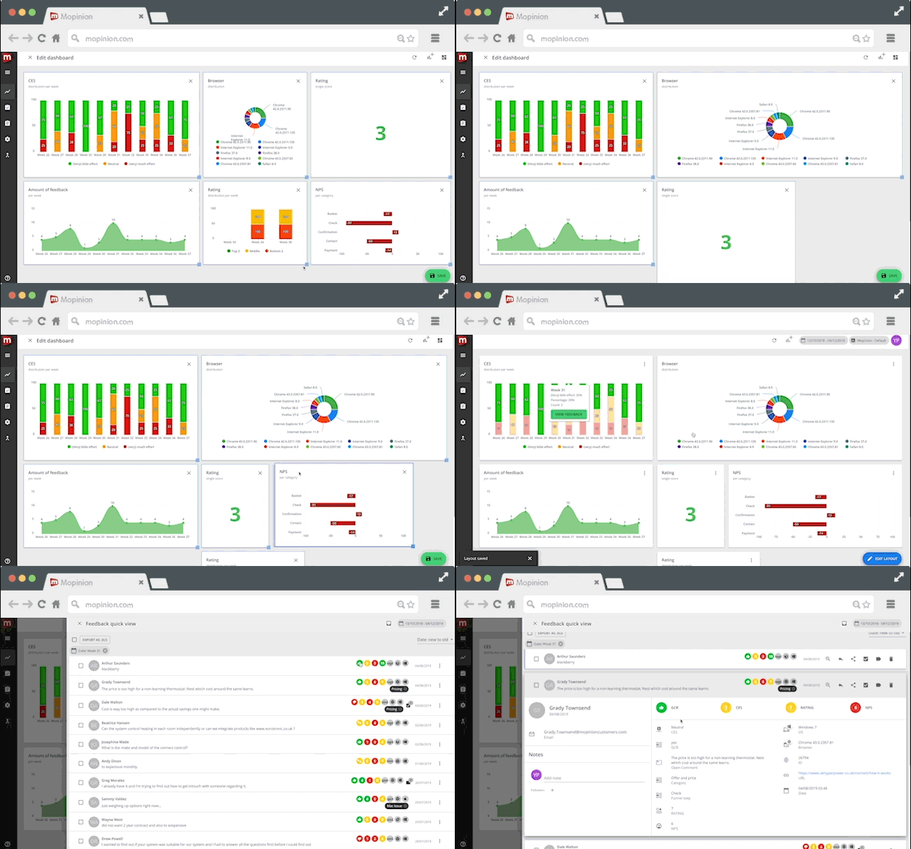
The new dashboard in Mopinion Raspberry is more flexible than ever. You start with a blank grid and you can design the complete layout of your personal dashboard. Not only can the size and shape of each individual item be adjusted, which will allow you to map out your dashboard in a way that it truly tells the story of your data. It’s also possible to have a closer look at specific feedback items correlating to a datapoint in a chart through the quickview sidebar, without having to leave the dashboard. This is a great time saver.
Subtle improvements in Text Analytics
Using Text Analytics is an efficient way of gaining insight in large unstructured data and texts. Text Analytics analyses and breaks down the content in open text fields within a feedback form. It also involves categorisation, clustering, pattern recognition, tagging and visualisation. In Mopinion Raspberry the visualisation has been adjusted and improved. It is now possible to open up words to have a look at the specific feedback details of this word. So instead of a generic summary of the context, you are able to have closer look into the details.Thanks to the quickview sidebar you can quickly dive into the details of a feedback item, without having to leave the current page. Save time by easily switch to different items without losing track of what you were working on.
Before we are enjoying the Christmas spirit…
In the coming weeks we have one last new and improved component of Mopinion Raspberry to introduce to you. So stay tuned!


